
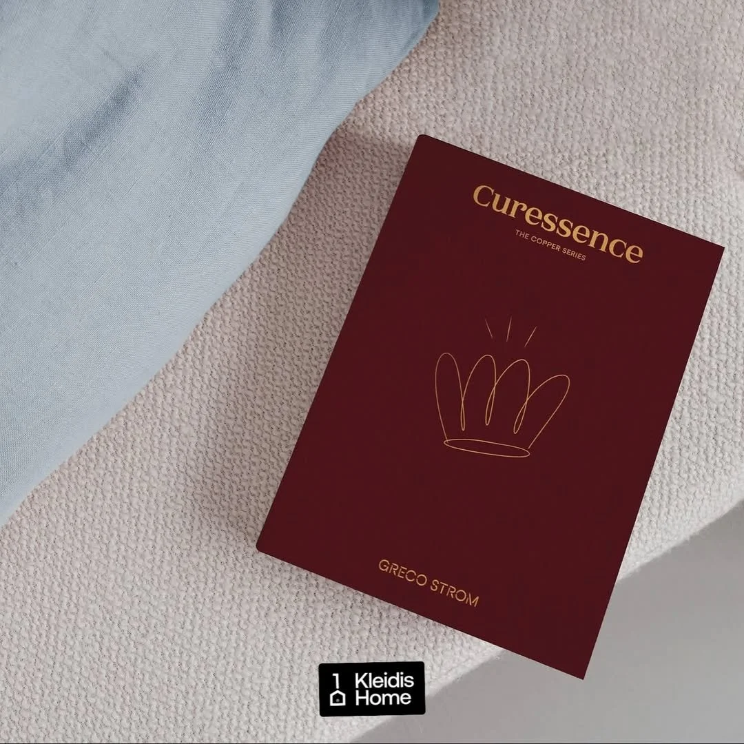
Curessence
Turning the innovation of the Greco Strom Copper Mattress Series into a brand.
The itch
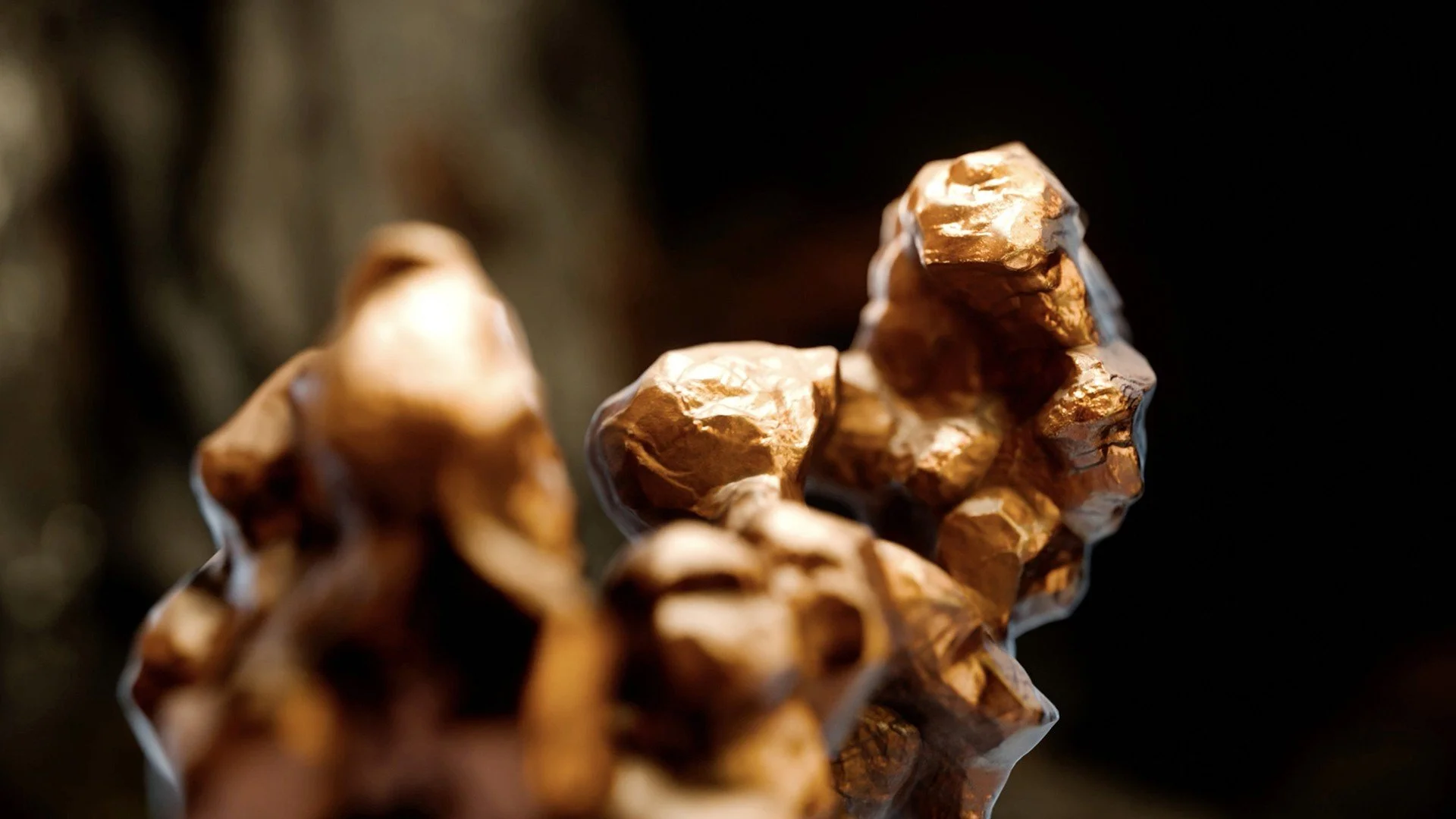
Greco Strom had developed a breakthrough: a series of mattresses infused with the restorative properties of copper. The challenge was to launch this innovation by moving beyond "new technology" — creating clear separation from the brand's existing premium lines, educating the market on copper's role in sleep, and building an emotional desire for this specific innovation.
The scratch
G Design Studio brought us in to develop the strategy, naming architecture, and brand narrative. Through research, we realized that for the innovation to land, we had to translate "copper technology" into a human benefit — moving beyond rest toward restoration.
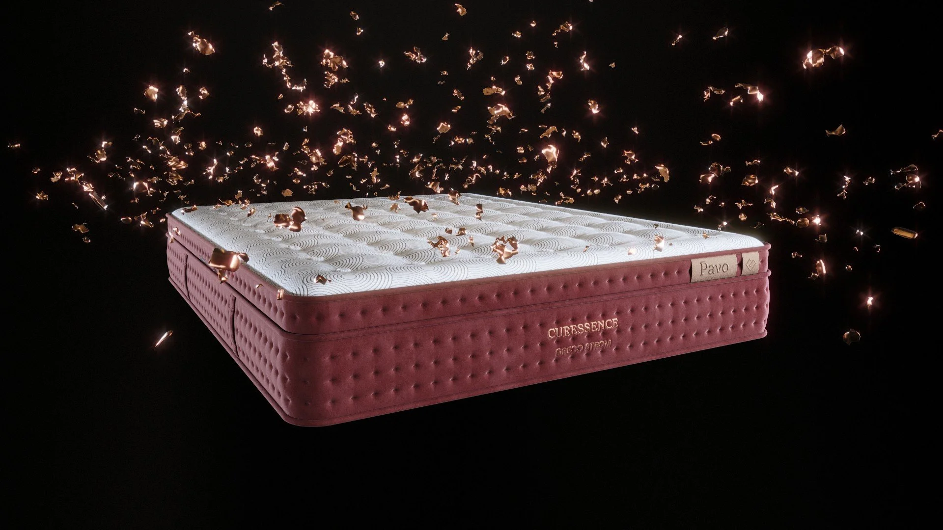
To bridge innovation and education, we crafted the master brand name Curessence. The name carries three layers: cure (healing, recovery), essence (purity, the core experience), and Cu, the chemical symbol for copper.
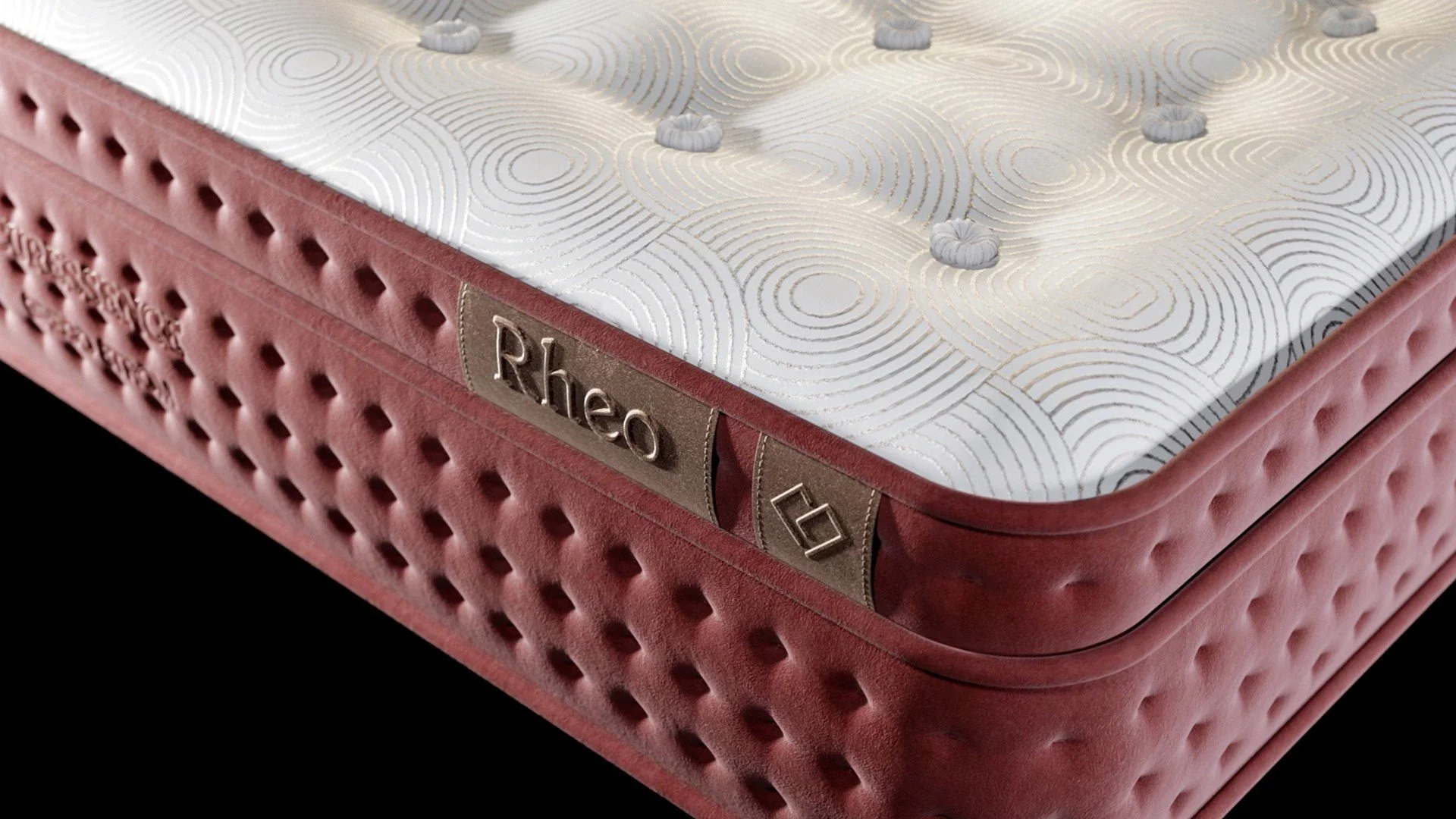
To keep the series legible and premium, we developed a verb-based naming architecture for the individual models using Greek roots: Pavo (to pause), Pneo (to breathe), Apto (to touch), and Rheo (to flow), each describing a physical and mental state of restoration. This became the foundation for an evocative, copper-led visual identity by G Design Studio, as well as a 360° communication platform for the brand.
The relief
ogether, we turned a complex technical launch into an intuitive, human-centered promise. In a category dominated by specs and features, we positioned Curessence as something closer to a wellness gadget — an elevated sleep experience designed for the pressures of modern life, where restoration is not a luxury, but a necessity.

TEAM
Creative Direction, Design: G Design Studio
Brand Strategy, Naming, Brand Narrative Development: Stav Papadaki, Marialena Gousiou