
Neptune Lines
Repositioning a global maritime leader.
The itch
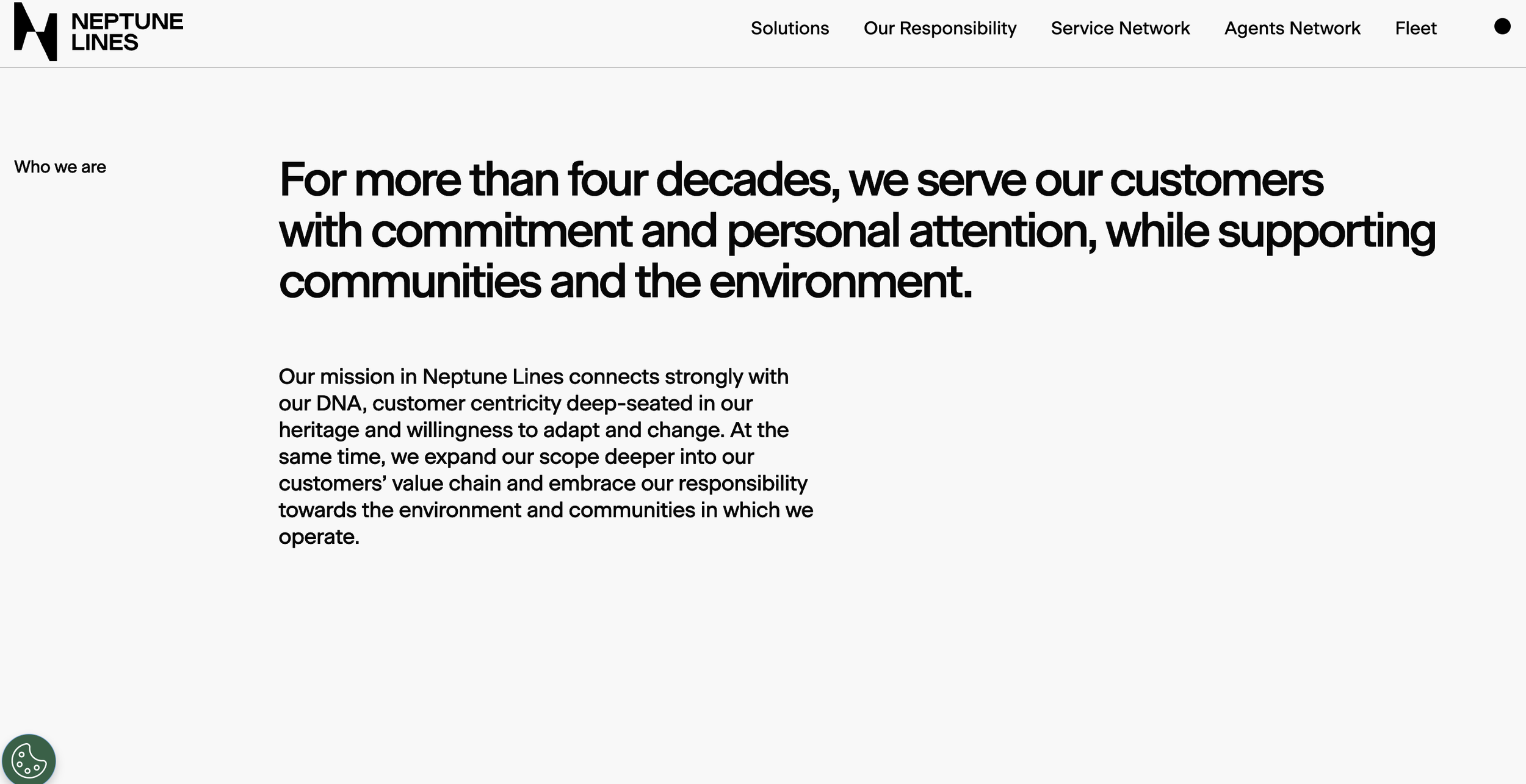
For more than 45 years, Neptune Lines has been a leading force in the vehicle transportation industry (car-carrier) across Europe and Asia. As the company entered a new chapter—marked by new leadership and global routes—the challenge was to honor its deep maritime legacy while repositioning the brand for a competitive, future-facing global market.
The scratch
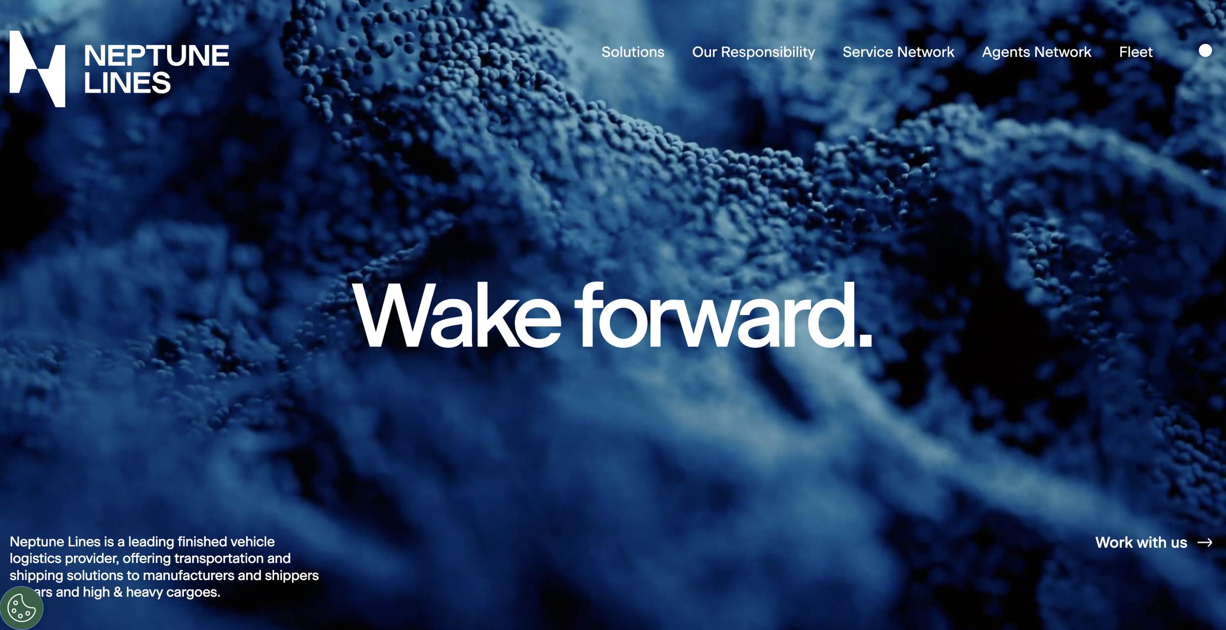
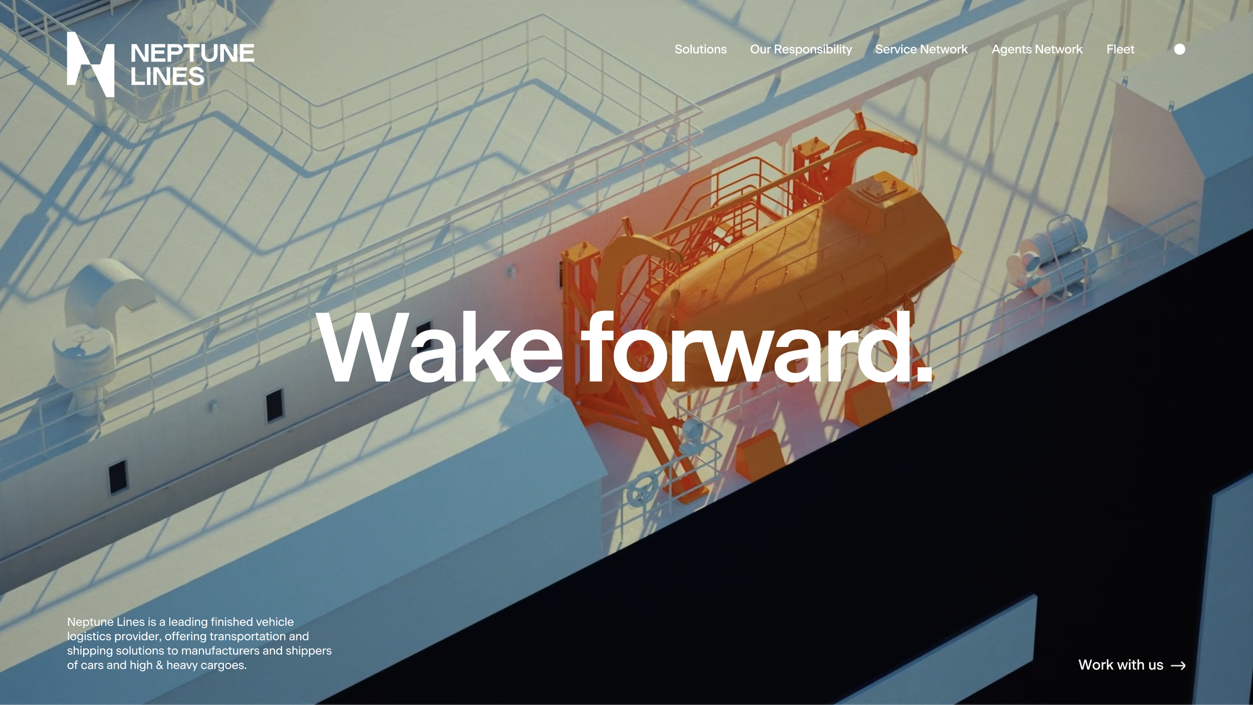
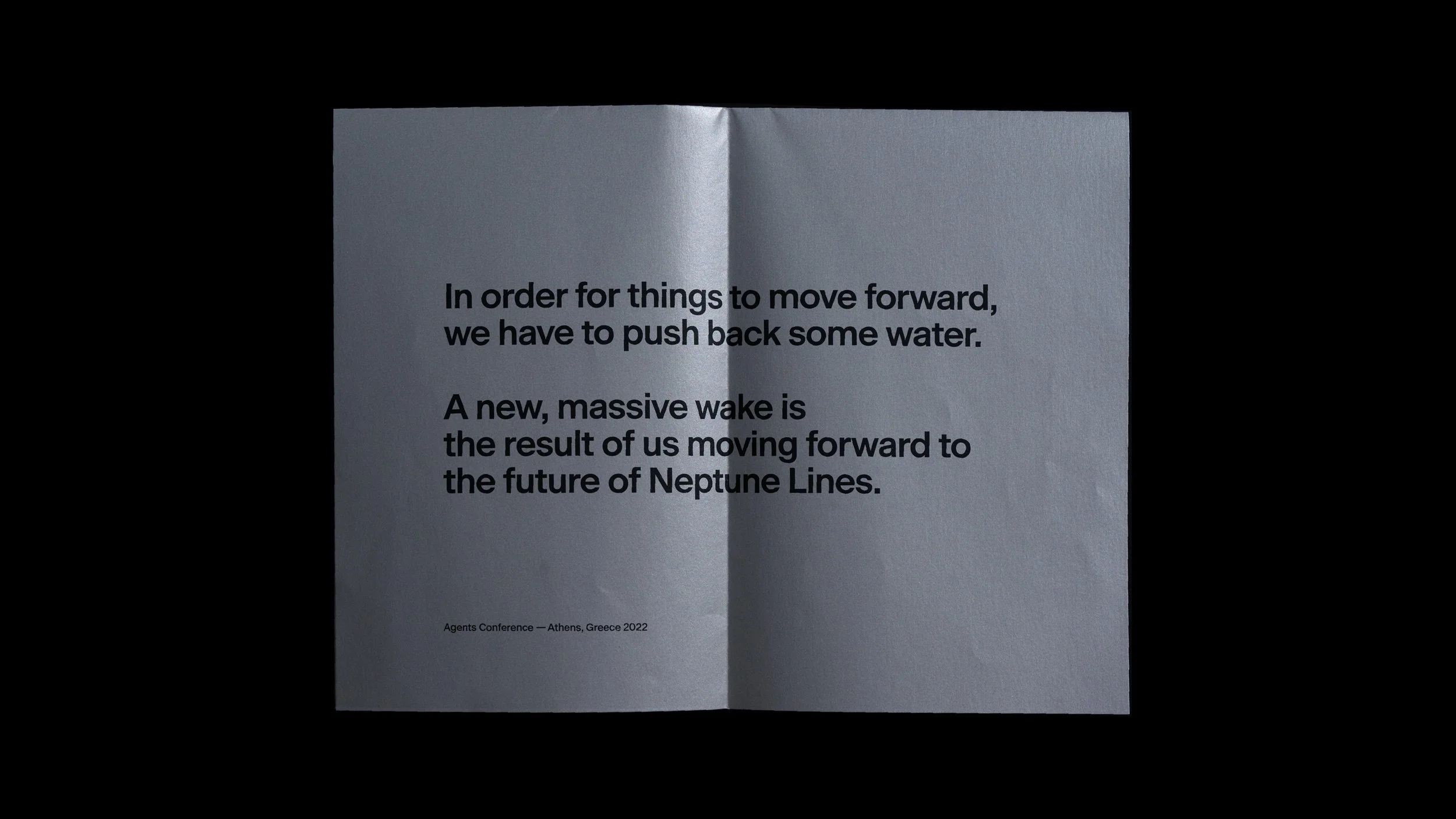
Specter Design Group brought us in for the creative strategy, messaging, and storytelling. Through deep market research and analysis, we found our core insight in the physics of motion: at sea, a ship only moves forward by pushing water back, creating a wake. While a wake points behind, it is the direct evidence of forward force.
This led to our central brand idea and tagline: Wake Forward.
It is a message of conscious momentum—moving ahead while remaining mindful of the "trace" left on the industry, the environment, and people. This "wake" became the inspiration for a dynamic visual system applied across every touchpoint, from the website and global conferences to the ships themselves.
The relief
A modern brand identity and rich narrative that respects Neptune Lines’ legacy while clearly signaling its future. This bold rebranding sets the company apart, emphasizing leadership, innovation, and responsibility, while welcoming staff and customers into a new era for the company.
TEAM
Creative Direction & Design: Specter Design Group
Brand Strategy, Key Message & Narrative Development: Stav Papadaki, Marialena Gousiou
3D & Animation: Dimitris Sakkas
SFX & Sound Design: Mellow Studio